30 years after the sculptor’s untimely death, Caroline Wiseman looks back on a phenomenal career in print.

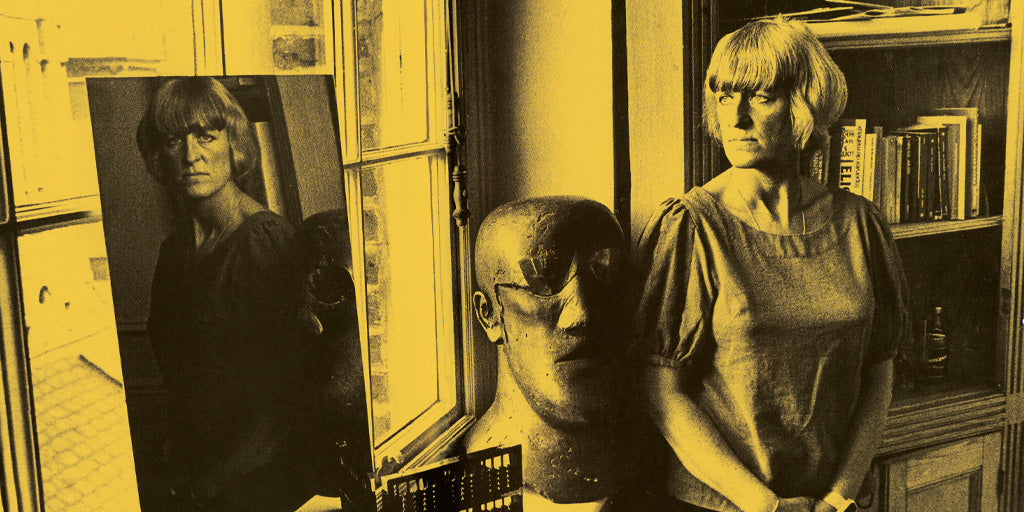
Elisabeth Frink in her home, Jorge Lewinski © The Lewinski Archive at Chatsworth
It’s exactly 30 years since Elisabeth Frink died. Invited by Mike Goldmark to write about her printmaking has given me the immense pleasure of re-immersing myself in this extraordinary artist. I haven’t had this treat since I wrote the catalogue raisonne of her prints in 1998. I am, as I was then, taken aback by her fruitful life, her astounding artistic output and her highly distinguished career. I am using a lot of superlatives, but she deserves them. And I am amazed at just how relevant her work is in 2023. How avant garde it was then and still is now! Her three essential themes: ‘The nature of man, the horseness of horses and the divine in human form’ are just as pertinent to us now as they were when she first challenged herself to respond to them in the 1950s.
Elisabeth Frink’s art still shocks. Aged only 18 she showed her drawings to Bryan Robertson who went on to become Director of the Whitechapel Art Gallery. He was astonished by what he saw: ‘Drawings of powerfully muscled and tendoned men, naked, on plunging and rearing or galloping horses’. And this from a middle class teenager from rural Suffolk. Memories of the violence of the second world war were seared into her mind. ‘As a young artist I lived very much in my imagination, in my mind, and I think that was the real reason for a lot of the work I did’, she said to Edward Lucie Smith at the end of her life. Because of this ability she rarely drew from life, instead she expressed the spirit of the form, whether man, animal or bird straight out of her mind and applied it to whatever medium she chose – drawing, sculpture or as we will be discussing here, printmaking.
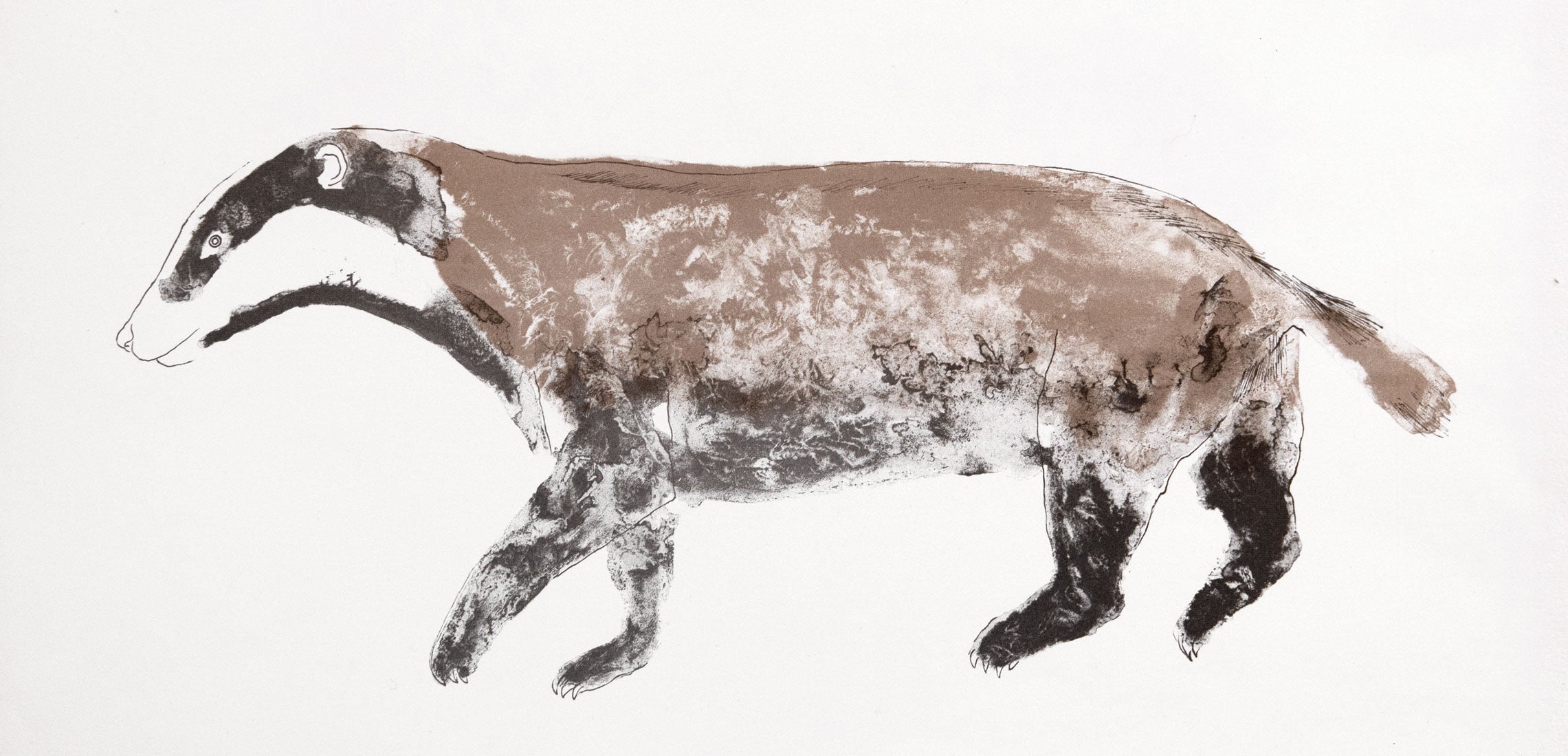
Elisabeth Frink, Badger, lithograph, 1970
The Tate bought a work from her first show when she was 21 years old and still a student at Chelsea School of Art. This propelled her into art-world stardom and she stayed there for the rest of her life. She was always ambitious for her art, always moving forwards and still felt she had so much to do when she died of cancer aged only 62. Her vision, talent and work ethic drove her forwards although she felt she was hampered by the fashion for abstraction. But she was far from being a representational artist; she was one of Britain’s finest Expressionists with her ability to draw from her imagination and express feelings through the forms she created.
Her drawings had a striking boldness which came from her powerful vision of subject matter as well as that subject matter itself – often naked men. And she drew huge with a natural draughtsmanship, using up the entirety of the paper using sweeping fluid strokes. Her printmaking was an extension of her drawing process. “I love doing prints”, she said, “and every time I do some I think this is exciting – why don’t I do more?”
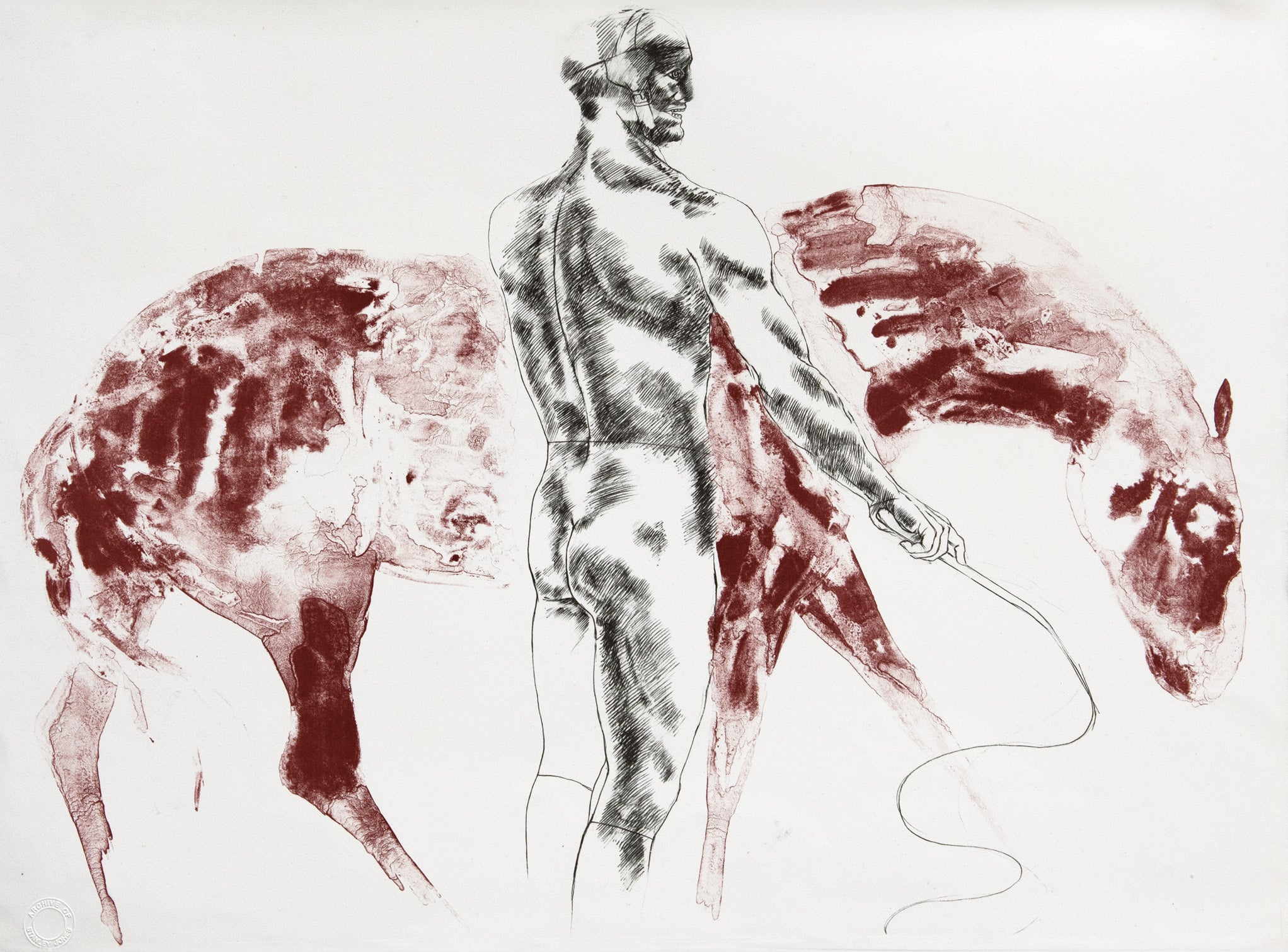
Elisabeth Frink, Man and Horse III, lithograph, 1971
Elisabeth Frink had the fortune to be introduced to Stanley Jones. Jones had studied at the Slade before working in Paris at the lithography workshop L’Atelier Patris. There he gained an understanding of the technical skills involved in lithography and of the skill of collaborating with artists to realise their ideas in print. As his colleague, the printmaker Kip Gresham, said of Jones ‘The process of listening and responding is why Stanley Jones gets such great results’. I interviewed several people who knew and worked with Elisabeth Frink for my catalogue raisonne and this included the three printmakers who worked closely with her: Stanley Jones, Nigel Oxley for her etchings and Kip Gresham for her screenprints.
Jones told me how fascinated Lis (as all those who knew her called her) became by printmaking. Lithography needs a balance between image and technique he said, and being a sculptor she loved the process of working on stone, seeing the image transformed into a printable object which could then be reworked and changed according to her wishes. She came to the studio with sketchbook notes. Then she would begin working on the stone, which was a very rare, old, traditional, flat lithographic stone which you can only get from Bavaria. A lithograph is drawn with line and tone in a very direct way. She worked out the composition using charcoal or conte crayon. Then she would draw firmly with lithographic crayon. She was very spontaneous, Jones told me, and would draw the broad outline onto the stone then with her fingers scrape and rub the surface. She loved the tactileness of it. She had an idea for each print but it was never a copy of a drawing and the end result was often very different from the idea, but, said Stanley Jones , she loved that. Each print was printed by hand and she was interested in all parts of the process. Each piece of paper was uneven and different and because it was sized it would soak up the ink and become part of the paper rather than simply lie on the surface. ‘She liked to hold the paper and feel its lustrous, soft but firm texture’, he added.
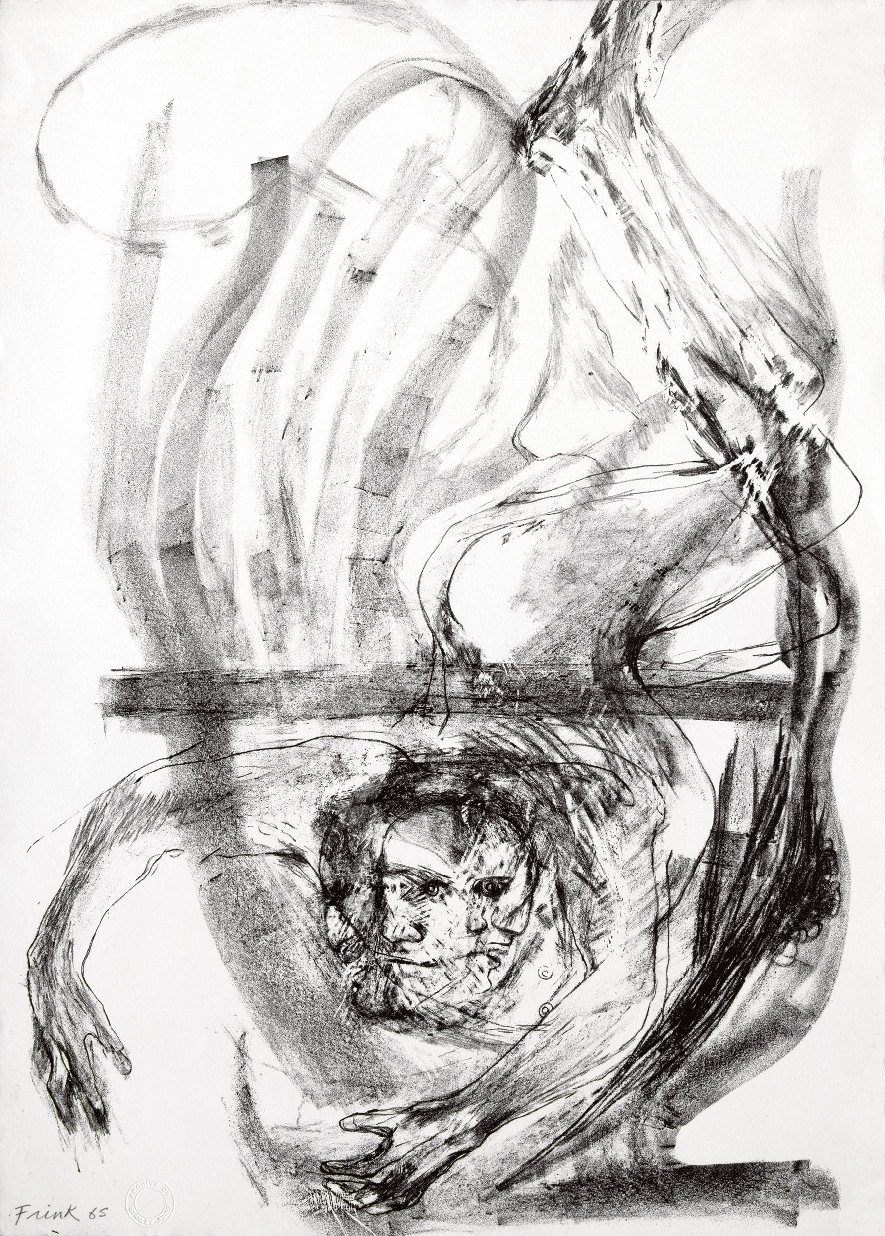
Elisabeth Frink, Spinning Man III, lithograph, 1965
A recurrent theme in Frink’s work is that of strong, often heroic, masculine images. These men are the subjects of many of her most important series, for example Spinning Man, Running Man and Green Man. This devotion to heroic male figures might have stemmed partly from the long absences of her father when he away during the war. Also influential were the photographs she saw in the 50s of the French ‘bird-man’ Valentin who heroically jumped out of an aeroplane and she thought of him as being very vulnerable.
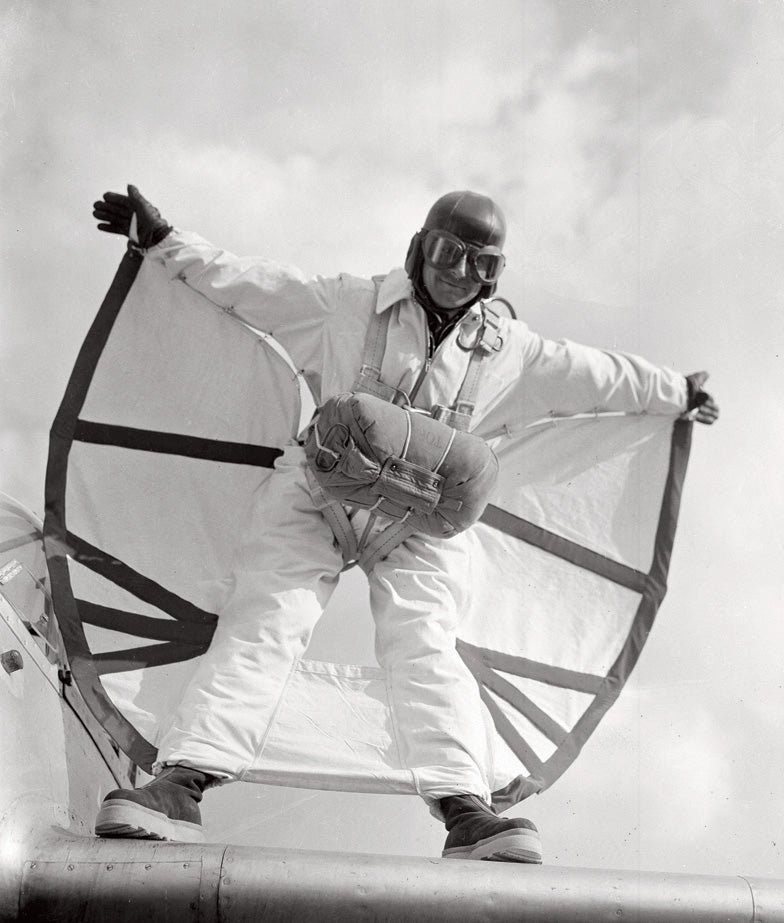
Leo Valentin photographed by Jean-Jacques Levy demonstrating his ‘birdman’ suit at the Villacoublay Airfield in Paris, France, April 15, 1950
The Images series explore a completely different subject – animals – and used another lithographic technique. Because she wanted to introduce colour, printer and artist used a ground zinc plate rather than stone. As a country girl she loved animals and Jones told me how she used to go to the zoo and sketch and use these for reference. She wanted to suggest colour rather than describe it. She wanted to capture the spirit of the animal.
Through lithography Stanley Jones was able to help Frink create the molten look of bronze on her next print Grey Rider. It needed diluted washes of colour. For the Eight Animals series Jones introduced yet another technique, used by Picasso and Braque, to help Frink achieve the result she wanted. Jones told me how they would have long discussions about her ideas and the effects she wanted to achieve. For the Man and Horse and Horse and Rider series she wanted to explore the relationship between man and beast. This required variations to the lithographic process so that the end result brought a physical and spiritual element which merged the two as one.
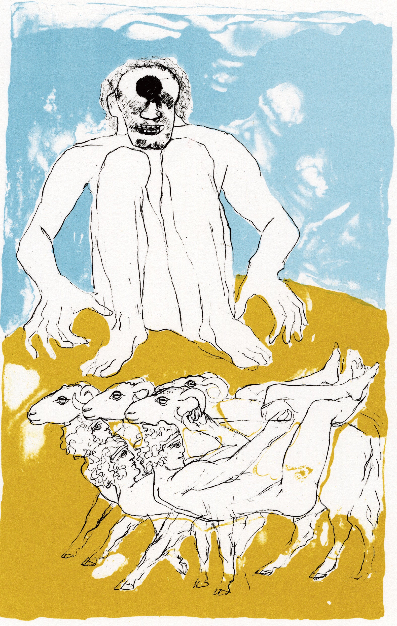
Elisabeth Frink, Cyclops (from the Odyssey suite), lithograph, 1974
For the Odyssey Frink used stronger colours. The Corrida series required yet another technique using distilled water which would help her exploit the theme of force, movement and violence. Now colour was becoming more import for Frink and for the Seabirds series she drew with washes onto zinc plates then put in areas of colour.
Etching was another printmaking technique which would allow Elisabeth Frink to achieve a different range of effects and Nigel Oxley at White Ink was prepared to make the process accommodate whatever she wanted to achieve. Frink loved Greek myths and the subject matter allowed her to give full reign to her imagination and her skill as a draughtsman. The 19 images of the Canterbury Tales were a daunting task, Oxley told me. But he made Frink relax so she could concentrate on the image, and she then produced excellent prints he said. Sometimes they incorporated creative accidents such as the air bubbles visible in the Nun’s Priest’s Tale. ‘Being spherical they echo the moon’ Oxley told me, ‘so that they added to the celestial effect – an accident – but Lis insisted they remain’. In the Pardoner’s Tale ‘a leg got lost but the image still worked so Lis decided to not to change it’.

Elisabeth Frink, The Reeve's Tale (from the Canterbury Tales II series), etching & aquatint, 1972
Frink grew increasingly confident with the etching needle for she was always professional and mastered each skill from drawing to casting in bronze to lithography to etching and ultimately to screenprinting. She made the process fun and Oxley tells how they would go for lunch to the George Inn on Borough High Street , which happened to be one of the starting places for the original pilgrimage to Canterbury. Oxley introduced all sorts of ingenious ways to achieve effects including pressing muslin into the soft ground wax to give texture to the dress in The Merchant’s Tale. He went into fascinating detail during our discussion and I recount this in my catalogue raisonne.
Later in life, after a visit to Australia, Elisabeth Frink became interested in colour. During the last four years of her life she had a very successful screenprinting collaboration with Kip Gresham of Chilford Hall Press, and later at Curwen Chilford Prints when Stanley Jones and Kip Gresham joined forces. As Kip Gresham told me, screenprinting very much suited her drawing at that time, and the relative speed and directness of the medium were undoubtedly a revelation to her. ‘In the late 1980s her drawing had become very powerful and there was a terrific confidence and certainty about her line’. She took to the new drawing and painting materials quite effortlessly, and this comes through in her work; her touch is not masked or over-emphasised by the process, but fully revealed.
Gresham took all the artwork materials down in his car to Woolland where Frink lived in Dorset. She and Alex, her third husband, were huge fun, Gresham said, and great hosts. ‘Lis took the work very seriously and was a treat to work with, for she had much enthusiasm and devotion. She had a real desire to understand how and why the materials perform in a particular way, a characteristic one frequently finds with sculptors. Over time I have noticed that sculptors are often the strongest printmakers’.
Frink soon mastered the skills. Gresham says that few artists are good at laying down washes but that Frink was exceptional. It requires, he told me, a certainty about the course of action and a willingness to accept the organic, internal qualities that the materials will deliver. Her earlier experiences with lithography, he felt sure, allowed her to work with the process rather than fight it.
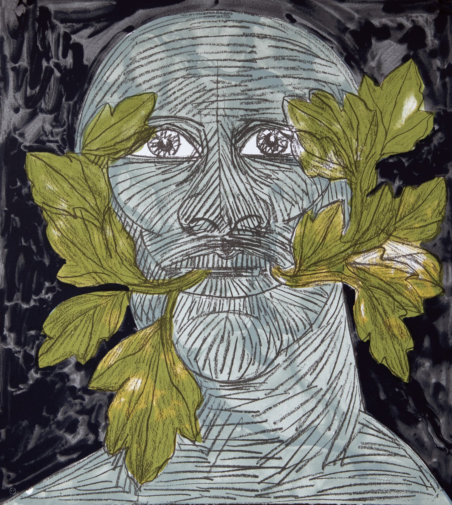
Elisabeth Frink, Green Man (black), screenprint, 1992
The last group of images Frink made were the Green Man series. By now Frink was ill with throat cancer and had been given a book on the green man which is about regeneration and rebirth. The idea fascinated her and she decided to devote her next group of prints to this area which was so emotionally and instinctively close to her at this stage in her life. Gresham described how they worked. ‘The method we used was quite new because she wanted to use many more closely integrated colours. She drew with graphite and dilute washes on to a new surface called Truegrain which allows for very smooth tonal graduations’. Apparently the proofing was a long and complex business – but in my opinion – worth it! I personally consider them her swansong, the crowing of her career, and that is why I chose to put Green Man Blue on the cover of the catalogue raisonne.
Elisabeth Frink was able to integrate the masculine and feminine sides to her personality. Shortly before she died she spoke to Edward Lucie Smith about her life as an artist and touched upon her femininity. ‘The idea of things with a double nature has always been present in my work, because I don’t feel that my work truly belongs to me. In a sense I’ve always been surprised to find myself as an artist, because my family background and my childhood were so much removed from that kind of thing. I always find I am split down the middle. On one side there is the creative person. On the other is someone – I wouldn’t say conventional – but more straightforwardly practical. I enjoy my family and practical things like cooking. Perhaps that’s because I am a female. I think a lot of women have sacrificed a great deal to become artists. They’ve possibly avoided getting married. I’ve been very lucky in that I’ve had very happy times with my family’.
Elisabeth Frink for me is a perfect example of a supremely successful artist who happens to be female.
‘I am using man as a form. Men’s bodies and heads, their whole structure are what I need as a vehicle for what I am trying to say, to convey, either strength or sadness’. Frink, singlehandedly, broke through the glass ceiling with this fearless attitude. This is why I used this quote from her as a frontispiece for the catalogue raisonne. Which other artist let alone female artist comes close to Elisabeth Frink in terms of audacity of purpose and method? Antony Gormley sculpts his body, Tracey Emin creates images of poignant emotion, but Elisabeth Frink did both, masterfully, years before them. She was avant garde, a revolutionary. She was a phenomenon, an outstanding figure of 20th century British art.
Caroline Wiseman is an art dealer and writer, Senior Visiting Fellow at the University of Suffolk, an Ambassador for the Princes Trust, and a Fellow of the Royal Society of the Arts. Having previously served as a trustee of Paintings in Hospitals, in 2010 she co-founded the Aldeburgh Beach Lookout as a centre for public viewing and discussion of modern art. In 1998 she authored the catalogue raisonné of Elisabeth Frink’s work in print.


